How to Design an Outdoor Banner for a Grocery Store
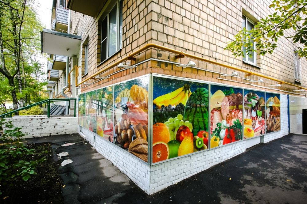
Outdoor advertising is an excellent tool for attracting potential customers to your grocery store. A well-designed banner can be an effective marketing tool, helping to increase traffic and sales. Large-format printing is the optimal choice for this type of advertising. It allows for high-quality images to be created on durable, long-lasting materials that can withstand the elements.
Choosing a Material
Outdoor banners can be made from PVC film, mesh banner material, or fabric. Each of these options has its own advantages and disadvantages, so it’s important to carefully consider them.
PVC film is the most common and affordable material for banners. It is highly durable and resistant to mechanical damage and weather conditions. However, it’s important to keep in mind that strong winds can cause windage on PVC banners, which can lead to damage.
Mesh banner material is a perforated mesh that allows air to pass through freely. This makes such a banner more wind-resistant and reduces the risk of damage. Mesh banners are also lighter, making them easier to install. Their main drawback is lower visual image density compared to PVC film.
Banner fabric is another option for creating outdoor banners. It is highly durable, weather-resistant, and offers a more pleasing visual effect than mesh materials. However, banner fabric is generally more expensive than other options.
Banner Design
Start by clearly defining the purpose—do you simply need to inform about your store’s presence, announce a promotion or special offer, or create a striking image. Based on this, develop a design concept and key visual elements.

The key elements of the banner should be a concise and memorable logo of your store, striking photographs or product illustrations, and a clearly defined slogan or call to action. Keep in mind that passersby will have very little time to process information in outdoor settings, so the design should be as simple and clear as possible.
Pay special attention to the choice of fonts and color scheme. The former should be large and easy to read, while the latter should be high-contrast and eye-catching. Avoid overly detailed and complex compositions – instead, focus on a few key visual elements.